Galaxy A8 Review – Has Samsung Hit the Midrange Sweet Spot?
Okay so I recently switched a plan that allowed me to purchase a Galaxy A8 as it ended up making the plan cheaper it wouldn’t cost me more per month and in addition I was offered a $100 Gift card NO BRAINER besides the A5 was cracked and getting worse by the day and so in the end I made the executive choice to retire the A5 so I ended up with the A8
SO how did that end up well the device was interesting I like to call it the Galaxy S9E because thats closer to what this is.
So lets go over this
So my first impressions were alot better than they were with that J16 and the Tab A but this is probably because it came with a higher end device the Box had nicer artwork and with a very simple blue A8 Logo you slide the sleeve off and lift the box up and you then get to see the a box of papers and it comes with although Im sad the Canadian version didn’t come with the free crappy case its not perfect but hey its something to use while your waiting for your otter box to come in from amazon the inclusion of a fast charger is a nice touch as well as headphones with some strange connector I’m not sure what its for I’m fairly certain Fred Flintstone has the same one there appears to be a part on the phone that matches it. Of course im joking what I really mean is the Headphone jack which ill get to later
First impressions of the device
Were honestly a bit strange Picking it up I was expecting a bit of a more rounded phone as My A5 was so this was a bit strange to me I was expecting a screen curve with this aspect ratio but Im thankful they didn’t all it would do is make it more expensive to fix for me and it doesn’t really make it more immersive in my eyes anyways so in design is okay
Okay so Booting the phone up
We get a setup screen that appears to entirely be taken over by Samsungs interface I personally don’t mind it as its a big departure from the older devices where the device would be like part Samsung then the rest would be stock android until like the last 2 things we’ve come a long way.
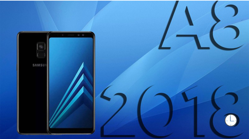
Entering the operating system We get to see the New Samsung interface immediately hating the wallpaper I change It to the blue one with 3 arrows anyone thats seen the dummy phone version of this will know what I’m talking about other than that nothing special fairly basic slide up to see all apps like the A5 same android Oreo with Samsung Experience only difference is the annoying Bixby Home Screen which seems very pointless to me as I find no value in it the home screen on my phone serves one purpose it is to be a Launchpad for my Apps and to hold a photo for me
The camera is an area I’m not really picky about nor am I an expert now what I do think is it can use work honestly I believe this can be corrected with software and it needs work and stabilization because the photos need work the colours are off but not in a terrible way if that makes sense its far better than when I was using my A5 there was never a good photo that came outta that thing I will upload some sample photos of the Galaxy A8 in comparison to the iPhone XR as well as the Predecessor Galaxy A5 and a low end device (J16) so you can get an idea of the camera performance across the board
Using the device
The specs are great but sadly the phone is just weighed down by the TouchWiz interface I’ve had this issue since the Galaxy S3 and IT STILL ISN’T RESOLVED This phone was released 7 Years since I started having this issue! And it still a problem??!? I don’t know if its google or Samsungs fault as the issue however if I had to guess based on the fact that the only issue I’ve had this with Samsung… I think I can make a guess
Either way the Battery has become way better than it did back in the day usually id be lucky if the battery last me a few hours on not only my S3 and S4 but the phone is able to get me a few days its better now almost as good as my iPhone XR but it’ll be a while until it can get to that Level when It get there then it’ll end up being alot better however it lasts long enough and its come a long way since then
Media Playback
A big part of my phone is enjoying Media such as music and videos
The screen is really good it looks great and AMOLED is a great display technology with the exception of the risk of burn in of the display is alright if a bit more dull than the A5
The audio is another can of worms and in the end the speaker is tiny tin-ie and too easily covered the 3 T’s but being used to it on the A5 I dismissed it so I then attempted to use the included headphones but the sound wasn’t all there so I figured id try my nice Sony ones besides I’m more familiar with that than I am with the Samsung ones but it still didn’t sound as good and I’m no audiophile there was just something really strange with these.. I don’t know why but it seems like every Samsung can never give me the same sound quality of something like the iPhone I guess I can try bluetooth but I’m using the exact same files.
Ending
Okay so this may have sounded like a negative review it may sound like I hate the A8… But thats not the Case the long and short of it is the fact that I really do like the phone I went in knowing this isn’t perfect because I wasn’t expecting it to be alot of these issues apply to the S8 and the S9 honestly it practically is one just with some features removed much like I called the A5 the S7 Neo I call this one the S9E essentially the same phone just with some missing features Wireless charging would have been a nice touch but at a far lower cost in the end I don’t hate the A8 I like it not enough to replace my iPhone XR But thats not what it was trying to do anyways I think its done a fine job at doing what it was designed to its not trying to be the best nor is it trying to do something really groundbreaking its just trying to offer a good solid midrange phone and I think its done that well.
Keep in Mind a lot of these complaints maybe resolved with the One UI Update well need to take a look at that when It comes out so stay posted for a review


